Mobile Game Design - The Floor is Lava
Background
The Floor is Lava is a group passion project on which I was the sole designer. I worked alongside a game developer to create user friendly access to game content and implement consistent design language throughout the game.
As a small team working to launch the app, I also practiced level design.
The game's key mechanic is a series of boots that alter the way you interact with your environment to solve a series of puzzles. This required a great deal of interaction design throughout the app, including the gameplay.
Play the game here or on simmer.io
Practices
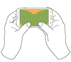
The physical constraints of the game's format offer little strain. To maximize comfort, different navigation menus were examined first.
Menu interactions and aesthetics are aligned from screen to screen for a comfortable experience.
The Natural Thumb Zone
Solutions & Outcomes
Using common Material Design principles I designed a cleaner heads-up display as well as ergonomic homepage and navigation menus. When handling First Time Use I also introduced direct contextual feedback, labeling, and messages to prevent simple gameplay errors.
Navigation
Considering the natural thumb zone, it seemed logical to shift to a homepage and main menu that is much more comfortable and ergonomic for any user and places their thumbs into the gameplay position.
Original Homepage
Current Homepage
Clean visuals assist a simple forward & reverse navigation method that we strive for using increased elevation, clear iconography, and modal menus so the user can continue playing as fast as possible.
Original Modal
Current Modal
In the initial stages the return arrow was not within the modal, making it easily confused with the more centrally located 'X' icon previously visible behind the options. Preventing this error was the leading factor into cleaning up the modal menus.
This led us into the details of adapting for growth, including changes in browsing such as from a carousel to a list that are much more ergonomic and flexible with the constant addition of levels:
Original Level Selection
Current Level Select
Finally, for error prevention we added tutorials and in-game tips so that varying elements were understood such as each type of boot, clear actions, and familiarity with the mechanics and landscape was generated quickly.
The faster someone learns the game's mechanics and key elements, the more likely they are to continue playing. After some user testing we discovered we required this clarity. Tips that we picked up throughout the project taught us how to manage product development as well.
Gameplay and Level Design
Practicing level design was a lesson in product management as much as it was about interface mechanics.
Ensuring difficulty progressed along with the game required a balance between an enjoyable user journey and enhanced difficulties in later levels. This meant keeping mechanics simple and consistent while road-mapping each level to introduce new complexities in a progressive user journey; reaching the same goal at every level.
Background
Practices
Product Vision: At the outset of this project we adopted a rough outline of the product progression at each level of the game.
They become increasingly more engaging and difficult and we took an agile approach to learn from every new addition.
Solutions & Outcomes
Following convention, game mechanics are consistent so that users avoid the most simple errors. While the content changes and becomes more complex across levels, the interface and interactions remain aligned. Elements have flexible functions when necessary but retain their location.
Gameplay
Games rely heavily on icons and we felt it was important that those icons reflect your characters capability.
For example, a character who needs to cross lava would need to see, and select, the volcano icon in their inventory.
The same is true for controlling the character and understanding how users consider the environment around them. Sticking with convention, we use a joystick and jump combo for movement. These are also reliable elements in leveraging elevation for an intuitive HUD that is comfortable in small and large levels.
At first upon acquisition of boots you would immediately equip them and easily lose a level accidentally. I suggested messaging on the inventory button to keep the player aware (bottom right) without altering what they already had equipped.
Early in level design I introduced transparent walls (below) so important in-game elements are not a frustration. These scenes and the ones above it showcase the quantities and different types of in-game feedback currently received.


