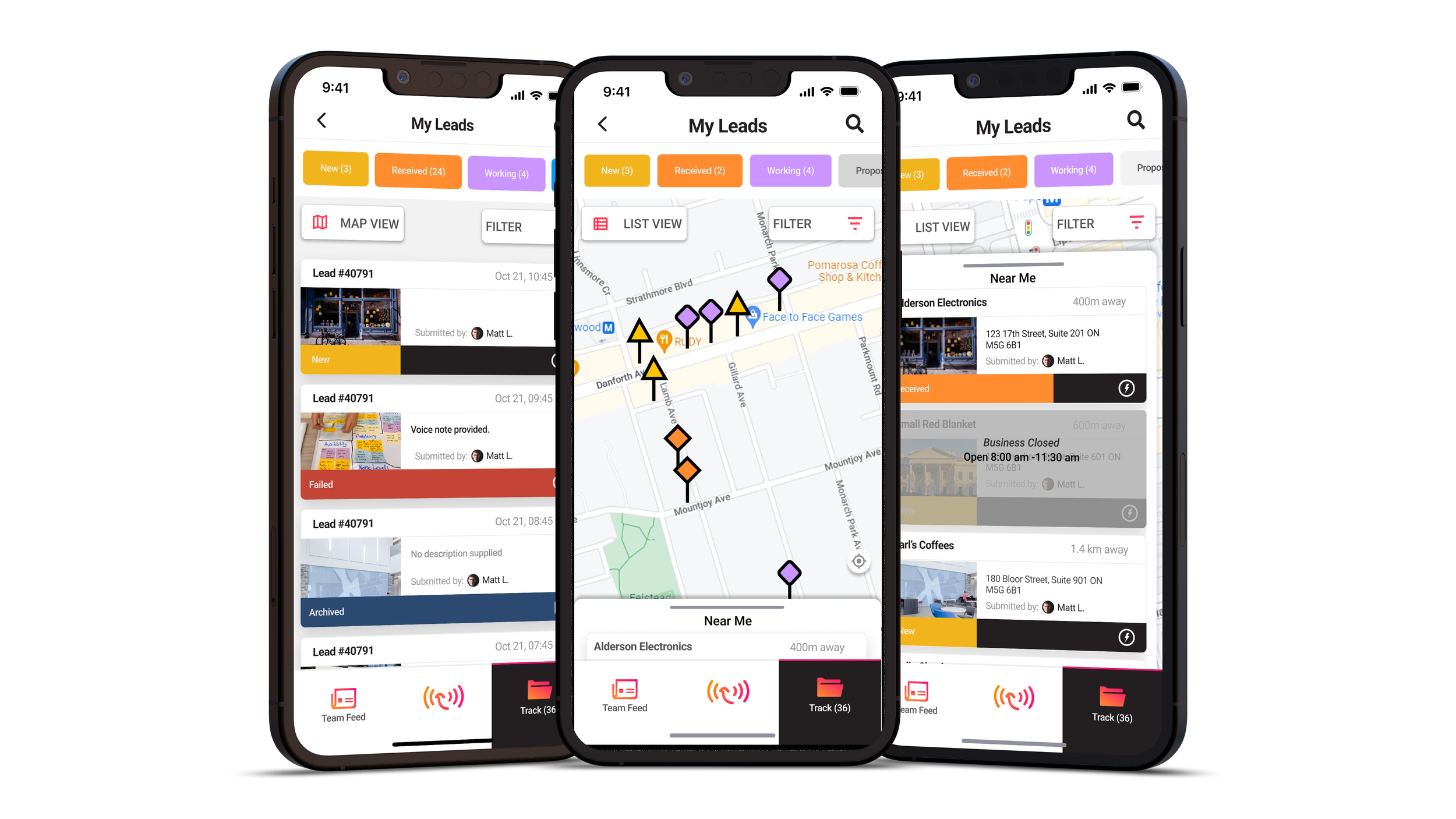
CRM Solutions - Map Dashboard
Leveraging sales territories with cross-platform interactive geography.
Summary:
Wingmate prides itself on using geolocation to aid truck drivers and salespeople in keeping tabs on business leads. This feature improves the mobile experience for outside sales and service teams with and without internet.
Problem: The map dashboard for web was nearly deprecated but still received traffic. It was also not functional across mobile devices and users relied on the application off the grid.
Approach: Utilize the geolocation features already integrated with Wingmate to create a user-friendly, visually accessible map. We used location markers to display customer sales progress and improved the visuals through beta-testing.
Company
Wingmate
Year
2023
Role
UX/UI Designer
Opportunity Space
Mobile users have the option of being presented information from the Lead Details page on a map dashboard but information was primarily laid out in a list view. The problem for frontline workers was the need to toggle between views while out in the field. Understanding the physical dangers of this pain point and how it effected employee efficiency, we sought out options that could help them increase productivity.
Mobile Platform
Background and Ideation - User Flow Visualization
Empathy Mapping broke up various user problems and envisioned the difficult aspects of the static map page. Clear and accessible map markers were the top issue.
This process was useful in defining the scope of issues that users found.
Empathy mapping determined that adding a familiar digital environment layered with dynamic interactions would provide the outside service teams more involvement with the sales cycle.
Solution - Prospects and map in one view
The mobile map drawer allows users to see a list of nearby prospects with basic information such as their stage in the sales cycle without having to leave the map view.
Pairing information geographically with a readily available list of nearby businesses created a flexible environment.
Beta Testing
We offered our user base a beta version of the map view for web and mobile and learned that the map markers were difficult to find due to their similarity to the Google standards.
Key Insights
Due to the similarity in both colour and shape to the standard Google pins and map, the beta tested map markers were difficult to find on web and mobile.
Web Platform
Design Challenge - Visibility & Accessibility
Based on this feedback we created markers that were a balance between visibility and meaning, offering an accessible solution.
Original Layout and beta tested Map Markers using the standard pin shape and pre-existing stage colours
Solution
The final iteration resulted in vibrant markers that passed accessibility standards. They indicate a journey down the sales cycle, becoming more clear-cut shapes as they reach the final stages.
Varying shapes also provide extra feedback for users who cannot distinguish colours.
Final Map Markers - evolving shapes using new, accessible figures and colours
Web Platform Background and Iteration
While our team updated our web framework we looked at ways to add interactivity to this view and consequently more business details while limiting touchpoints.
Updates now allow adding a lead by clicking on a location, and displaying detailed popups.
Ideation and New Features
Pre-existing and new touchpoints were iterated upon via sketches and user journey diagramming.
Resulting touchpoints
Results and Impact
This feature engaged users with graphics, animations, and a responsive design that could be used anytime, anywhere. By using a familiar viewing platform we took a page that was nearly deprecated and revived it through colour and accessibility. We also serviced a user need to view more information in sales territories that are somewhat off the grid or completely offline.
With the addition of this feature, users that spent time in rural locations without an internet connection could stay twice as engaged with their position in the service and sales cycle.
Project Lessons
A major lesson learned from releasing this feature was the value of offering beta testing. It is well worth the time to offer a glimpse of your product to a group of clients in order to gain clear insights and empathy. Much like other contextual research methods, testing allowed our team to learn what pain points, such as visibility, were the most serious for our clientele.
I would have liked to spend more time reviewing and testing designs with clients across all Wingmate projects because these discoveries informed how to best engage with the target user base.


